This post is a summary for part of a class that Robert Manna and I taught at Autodesk University in November of 2010, and a more detailed explanation of the work shown in this earlier post. You can watch a video of the full presentation here, and also download a more complete document of the whole classe.
A note on making your own tools:
At some point all software will fail to supply you with the tools you need right out of the box. The challenge of computational design is often to figure out how to get what you have to do what you need. Revit’s Conceptual Modeling environment allows you to make very complex forms right out of the box, but sometimes you have to do a little legwork to achieve rational, build-able results.
Using the massing tools in conjunction with a custom panel for “analysis” it is possible to begin to understand the limitations of freeform designs and to improve building elements that would be challenging, cost prohibitive or otherwise impossible to construct.
Measuring Surface Deformation
One of the limitations designers must face is the ability of building materials to flex out of plane. Usually it is not a matter of a material either needing to be absolutely flat or being infinitely flexible, but rather identifying an allowable tolerance. This exercise shows how much flexibility a form will demand of the materials that are used to construct it. The “surface deformation” panel explained here is not meant as the final panel that will be used in a curtain system, rather it is meant to be a panel that can give the user feedback about the overall form they have designed. This is a tool to check assumptions and make larger design decisions early in the process before changes get really expensive.
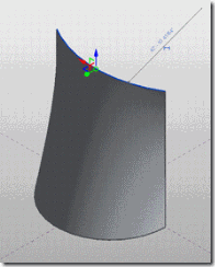
Let’s start by looking at a surface that is geometrically relatively simple, a “ruled surface” that is created by connecting one arc to another.
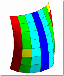
While formally simple, the analysis colors indicate that almost 30% of the panels (see in red) are more than 10” out of plane over 8’. This can indicate a difficult or impossible fabrication condition that would be good to identify early in the process.
Starting off, set up your relationships:
We’re going to end up with an isolated curtain system that will later be incorporated into a larger project. It helps to distinguish between the “Whole Project” and the “expensive façade” by isolating the façade element in a separate file, but there are more and less integrated ways to do this, depending on your project needs.
1) Create a mass form for the building. Create a form in such a way that you can later manipulate and refine the form. One way is to have your form as a separate mass.rfa, and load it into another family that will host it and your divided surface. This allows you to freely manipulate the surface and only get processor intensive analysis feedback on the surface only when you want it.
2) Divide the surface based on UV Coordinate grids: Using the out of the box UV coordinate grids, you begin to break up the form into sub elements. Adjust the spacing of the divisions to be a Maximum (in “layout” properties) of 8’x8’ (in “distance” properties).
3) Tabular Representation of Deformation: Now that you have set of comparably sized (but not identical) four sided divisions of the overall surface, you can look at their relative deformation over the surface.
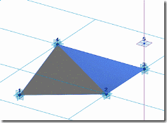
It is helpful at this point to ask “what is deformation?” Given that any triangle is a plane, you can think of deformation in quadrilaterals as the distance that any one point is out of plane with the other thee.
If you can measure this difference, you can measure deformation. In the context of a curtain panel by pattern in Revit, this can be constructed using out of the box tools.
a) Three point Invisible Workplane Hack: define a plane with a triangle between 3 of the points. Uncheck its visibility parameter.
b) Infinite line: Create a very long line using offset points as mentioned in the previous exercise; one point is offset in the positive direction, another in the negative direction. Connect these two offset points with a single line (note: in the line’s properties, under “reference”, make it “not a reference”, otherwise the selectable area of your divided surface will be unbearably large.) Uncheck its visibility parameter.
c) Host a point “by intersection”: place a point on the long line, select it, pick “host by intersection” from the options bar, and pick the triangular surface you made. Your hosted point will now be both constrained to the host line and aligned with the plane defined by your triangle.
d) Reporting parameters. On one of the vertical workplanes of the hosting adaptive point, make a dimension between the adaptive point and the point hosted by intersection. Make this dimension a reporting parameter. This reporting parameter will read out a value associated with each panel instance. This number is the amount each panel is out of plane, your panel’s deformation.
e) Shared parameters: making this measurement a shared parameter results in the ability to schedule the value of all your panels and identify which ones are too far out of plane.
f) Identify deformed panels in schedules in project. Load into a project and create a schedule of panels and deformation.
4) Visual Representation of Deformation: Tabular data is all well and good and makes the accountants happy. But we are a visual people; we want to see our data in our geometry. For this you need to have stronger reporting parameters that can drive geometry and create visual representations of deformation.
Not all reporting parameters are created equal. Reporting parameters made between “host” elements (generally these are the non-deletable elements that are baked into a template) can be used in formulas to drive geometry as well as schedule. Reporting parameters between non non-host elements can only be used in schedules. However, in adaptive components, any adaptive point is considered to be host geometry, and the distances between them can be used to make these “stronger” reporting parameters.
a) Create an adaptive component with five points, connect four of the points with reference lines to create a rectangle, and add a fifth line to the fifth point to make a “tail”.
b) Make a reporting parameter along the workplane of the tail between the 2 adaptive points. This reporting parameter is capable of driving formulas in the family, and therefore creating geometric and visual changes, in addition to being scheduled. This tail will be used later to measure deflection.
c) Use the Reporting parameter in formulas: In this case the reporting parameter is used to decide the value of a series of if/then formulas that turn on and off the visibility of 5 surfaces, each of which is a different color. If the value is more than 10”, only the red surface is visible, if it is between 7.5 and 10”, yellow, etc. It could also be used to create subdivisions of the surfaces, or turn on and off triangular panels for these cells, or any other number of visual or geometric representations
d) Load and place the Adaptive Component into the panel: The four points of the rectangular surface are placed on the adaptive points of the curtain panel; the end of the tail is hosted on the point hosted by intersection. As the panel goes more out of plane, the tail on the adaptive component gets longer, and its colors change.
e) Panelize your surface with this nested component and you will get a visual readout of your surface’s deflection.
f) Now you can make small or large changes to your underlying surface, reload it into your “analysis environment”, to fine tune your form. Often small changes will have large effects on planarity conditions, and designers can make informed early decisions about costs and aesthetics.
Generalizing the panel
This tool will allow you to interrogate many forms. Depending on the desired size of your panels and the range of allowable deflection of your materials, you will need to adjust the range of the if/then statements. This particular panel gives pretty good feedback on 8x8’ panels across a range of surfaces.
Once you get used to how it works, it can be used to quickly check assumptions about the surface planarity of a range of projects or to communicate problem areas to team members. Some people just don’t believe that surfaces like torus’s can be broken down into planer quadrilateral panels, or that ruled surfaces broken into quadrilaterals are necessarily non-planar.
These cases show the same panel instantiated in a number of simple and complex surfaces, all divided into “max spacing”=8’. While the panel sizes are not identical, there is a close enough approximation to get meaningful results from the panel. Feedback like this at early stages of design allows for rapid tinkering with forms, testing assumptions, and fine tuning geometry to make more constructible building components.
Download the Panel and supporting files from here. It isn’t perfect, but use it as a starting point for your own uses.


Zach - I've always loved this post, but I had never gotten a chance to test it out practically... until today. My firm had designed a nearly boat hull-like ceiling for an I-95 Maryland Travel Plaza project. The subcontractor responsible for the ceiling wanted to make sure the mock-up would consist of an area with the most extreme curvature. We were worried less about twisting (as the ceiling would consist of 6" wide/8' long boards) and more about normal bending - but following the concept you laid out in the post, and using a 1/3 step surface pattern, I was able to visually isolate the areas of the ceiling with the highest curvature. Peers were blown away and I got Kudos from higher-ups... So, THANKS!!!
ReplyDeleteHey Noah, so glad to hear that this helped out. There is one issue with that panel that it takes an asymmetrical measurement, always bending the upper right corner of the panel. In most situations this is totally fine, depending on how you plan on doing your panels and how the surface is shaped. A slightly different approach is the one I show here, start watching around 45 minutes into the video
ReplyDeletehttp://buildz.blogspot.com/2012/09/adaptive-components-from-data-to-tada.html. This panel does more of an averaged deformation.
I found this out the following week after I was asked to see how much the boards were getting twisted along there lengths as well. I hadn't seen the post you just linked to, so instead I used "abs(D1-D2)" for the total deflection value and had two adjacent corners each reporting a deflection value. It seems to have worked out. I was hoping to get a reported angle of deflection - but i could only get a vertical distance to report. but if necessary i can do the trig to back-calculate. Thanks again.
ReplyDeleteI love this post because it is such a clever way to use adaptive components to produce very useful information.
ReplyDeleteIt occurred to me that Visibility/Graphics might also work for colorizing a surface by curvature. My post at
http://texasarchitecture.blogspot.com/2013/09/visualizing-panel-curvature.html
shows this method.
Hi Dr. Mark. Yes! Using Vis/Graphics and filters is a much more efficient method. I do something very similar to your post here: http://buildz.blogspot.com/2012/02/computational-design-lab-reinventing.html
ReplyDeleteThe real advantage in embedding the logic in the family itself is just that the family then becomes a transferable tool for analysis, and doesn't require project specific setup. It is slower though.