The Wind Tunnel analysis available in Vasari 2.1 is mesmerizing.
. . . I think my building is going to suck pedestrians off the sidewalk. Mwah-hahahaha!
For basics on how to use the functionality, check out this link.
Now, a couple other things I like to consider when jumping in on this tool:
- Use 3d analysis for more robust results: 2d is fast, but only takes a small area of your model into consideration
- Let the analysis run for a while before really looking at it: crunching voxels is hard work, and you wanted to get some coffee anyway.
- Pause your analysis before exploring it: Moving around the data slice and using other methods of visualizing the analysis is where the fun comes in. This takes computing power, so you’ll want to stop analyzing and start visualizing.
The default behavior is to use “2d analysis”, which is very fast to calculate, but only takes into consideration the winds and geometry of a flat plane.
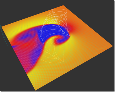
This is what I get after only a few seconds using the default settings on my model.
Now, this is fine, it gives you a good starting point to understanding your model. But with my corkscrewing geometry, I’m pretty sure that I’m getting a vigorous 3 dimensional churn, probably a big rush of wind coming up from the innocent victim trap plaza. To take this into account, you need to check the 3D Analysis button.
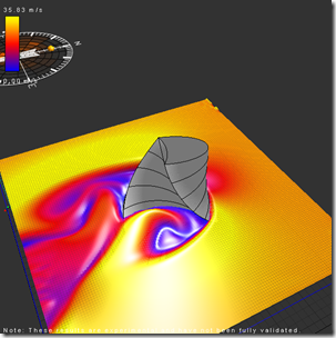
This is where you will jump from “real time” to something more intensive. For instance, on my 8 core machine, I popped on 3d analysis, waited 4 minutes, and had this
Notice how most of the area around the model is not very differentiated? This is because my computer is just beginning to process all the voxels. With that one button push I go from 15,626 2d cells to 1,515,625 3d cells being analyzed. But you can also see the spiraling death vortex turbulence area that I suspected would form in the recessed area of the tower. Mwa-hahahaha!
8 minutes after start:
20 minutes:
After about 40 or 50 minutes my simulation started wavering back and forth between this
and this.
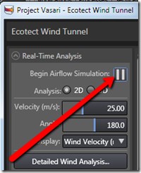
At which point I say “good enough” and pause the Real-Time Analysis:
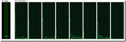
Which allows my processors to go from this:
to this:
Whew!
So with the analysis paused, I’m freed up to explore the model. If I left it still processing the data, it wouldn’t leave much of my poor machine’s brain power to manipulate the views, like scrubbing the XY slice up and down, or better yet, playing with the 3D Volumetric controls (more on that in another post).
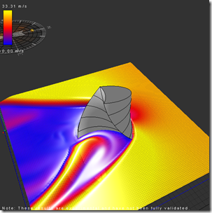
One quick thing I can do is look at various slices of the data. If you go to the 2D Grid slice tab, changing the 3d Axis will give you this:
Now compare that with my nearly immediate results from the 2d analysis’ vertical slice
You can see that there is certainly a relationship between the 2d and 3d analysis in terms of directionality and relative intensity of the wind velocity. But you can also see some significant differences. For instance, let’s adjust the Data Display to have the same Minimum/Maximum range displayed:
Going from an initial range of 0 - 102 m/s, I change the 2D analysis to match my 3d analysis of 0 - 32 m/s
So this is more of an apple to apples comparison of 2d to 3d:
Lots more to say on this functionality, we haven’t even looked at this stuff:
. . . stay tuned.







Awesome tutorial - can't believe this functionality is in Vasari!! One beef I have with the visualizations in vasari and ecotect, however, is the rainbow color map as the default scale. This is, hands down, the worst way to show quantitative information using color, and I wish they would help buck the trend. The different colors don't have equal luminance, so our eyes see the yellow as more important. There's also not an equal difference in perceptual color change between equal values on the scale - we're much more likely to see the transition from red-> yellow than purple->orange, for example. Not to mention that it's near useless for color blind people...
ReplyDeleteBut still, awesome tool!
Hi Ben,
ReplyDeleteYou can change the color map to a nice greyscale or sepia in this case. I agree from a color theory and infoviz point of view with what you are saying, that said most architects seem to really like the default coloring from ecotect and now used in various vasari analysis plugins.
-matt
Matt Jezyk
Sr. Product Manager, AEC Conceptual Design Products
Autodesk, Inc
Thanks for the response, Matt. To be honest the visualization I'm most interested in is the "flow lines" hinted at above- that is to me the most appropriate way to visualize flow dynamics.
ReplyDeleteExcellent analysis! How can we have a daily, monthly or yearly intermediate state of the wind conditions?
ReplyDeleteHi Nikos,
ReplyDeleteLaunch the "detailed wind analysis" from within the Wind Tunnel controls, from here you can specify what time period you wan to investigate.
Hi Zach,
ReplyDeleteGreat tutorial!
I've been exploring the software for a couple of days now and I also found the 3d analysis much more informative. However my poor mbp from late 2010 is struggling to run the analysis - it has, well.. 1 core, compared to your 8. As great as the 2d dynamic planes may be at showing flows around the building, is there a way to only show how each surface of the facade responds to the wind? For example, if my design is a simple rectangular extrusion, is there a function to just look at how the 4 elevations respond to wind in colored pixels?
HI Nikos, from the detailed wind analysis tab you can define a narrower range of data to look at
ReplyDeleteHi Jonathan, I'm afraid that there is not a function to look at isolated facades, you would need to move a slice around on the surface and looks at pressures that way.
Its all pretty amazing, but how do you export the data as numbers????
ReplyDelete